|
Hedge Clippings | Friday, 13 November 2020
Hedge Clippings is at a loss for words (not a frequent occurrence, as some might understand) when it comes to the US election - or at least to Trump's reaction to his loss. Come to think of it, is seems the Donald himself is also at a loss for words as well, as his public statements have been few and far between. There's an underlying concern about the state of democracy in the US, and the turmoil his refusal to accept the result is creating.
Of course, The Donald has never been shy when it comes to controversy, whatever the expense. Sadly his legacy is one victim of his personality, however one might view his achievements over his single term. The other, more concerning issue is the potential damage done between now and the 20th January, and the opportunity it provides to other powers - China and Russia in particular - to take advantage of the vacuum.
Meanwhile back to business! In the managed fund sector, or the broader equity market, and for that matter in financial markets as a whole, we are constantly faced with "averages" which although technically accurate, can be highly misleading.
There's an old saying regarding averages: "When your head is in the freezer, and your toes are in the oven, your temperature is average." So it is with managed funds, particularly with actively managed funds. And even with ETFs and index tracking funds the reality of course is that the index itself is an average. In the case of the ASX 200 made up of 200 stocks, each of which perform significantly differently to produce the average or index return.
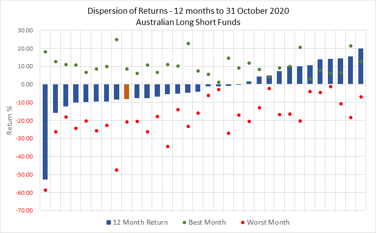
At www.fundmonitors.com we frequently quote a whole range of averages, but behind those there is a wide distribution of returns from individual funds. As can be seen from the chart below which just singles out Australian Long Short funds (including Equity Market Neutral, and 130/30 funds) the performance over 12 months to the end of October ranges from -50% through to +20%.
However even the headline returns of individual funds can be misleading - or at least need to be investigated as shown by the results for best and worst month highlighted by the green and red dots. While there are a number of other key performance indicators that need to be looked at such as volatility, Sharpe ratio and up-and-down capture, the best and worst month can give a good indication. Risk and return varies from investor to investor and whilst all investors seeking good return many of also wanting to do so without access volatility or risk.
What is also interesting from the chart below is that, in spite of the big variances between the best and worst months, the majority of Long Short funds, which are often considered to be more risky and more volatile than the market, have in fact outperformed the ASX 200 accumulation index (shown in orange) which has fallen just over 8% over the 12 months to the end of October.
|
|
|
The above chart is interesting: the bars clearly show the majority of funds out performed the ASX200 Accumulation Index, generally accepted as the relevant benchmark, although some may argue that as long/short or absolute return the appropriate benchmark is anything above 0%.
However, equally telling are the red dots representing each funds worst month, and to a lesser degree the corresponding green dots. Simply put it is much easier to perform well over the longer term (even though we have only focussed on 12 months in this instance) if you can avoid the market's worst months.
Protection of the downside is a vital aspect of performance, and depending on the investor's risk appetite, an important KPI when evaluating any fund.
|
|
|
News & Insights
Video interview with Garry Rollo from Montgomery Investment Management
Amazon, Volatility, and the Virtue of Patience by Aitken Investment Management
|