|
Hedge Clippings | Friday 23 August, 2019
Hedge Clippings, like many others, avidly reads and then dissects every nuance within the minutes of the RBA's monthly board meetings as we try to interpret or discern their views, and thus the future direction of monetary policy. This week was no different, although having read the August minutes we took a slightly different approach. Using the principal of "a picture paints a thousand words" we downloaded and printed the minutes and then set about highlighting in orange words or phrases that were cautious or negative, and in green those that were positive.
Hey presto, a colour coded picture of the RBA's mood and thoughts on the future. There's an element of discretion or subjectivity in the use of the various colours, which we viewed as having significantly more "orange" risk to the downside, than "green" to the upside, so readers might paint the picture differently. If you want to try it yourself, here's a link to the RBA's original "blank canvas".
While staying on the visual theme, although significantly more data driven, the chart below (courtesy of Craig Racine's Gyrostat Capital) shows falls of 20% or more in the S&P500 since the crash of 1929, which precedes even Hedge Clippings' experience, however we grew up regularly being reminded of how tough it was back then (although we're sure it was).
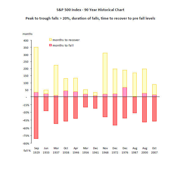
The chart not only shows the full % drawdown of each event, indicated by the red section of each bar below the line, but also the time taken (in months) for the fall to take place, indicated by the pink section in the middle, and finally the time taken in months for the market to recover to its pre fall high, represented by the top, or yellow section.
What it shows is that market events (in this case falls of 20% or more) are not as rare as one might think, having occurred 13 times including the big daddy of them all in 1929. Also, as shown by the date series, they occur frequently.
Next, the time taken for the fall to occur doesn't last long! This is the "down by elevator" effect, while the top section of the bar shows recovery is not even "up by the escalator" by comparison. It's more of a long uphill foot slog. Remember, when an asset or market falls by 50% it needs to rise by 100% to reach its pre fall value.
Taking this forward to the current environment, at a time when many are questioning the equity market's stability in the face of inverted bond yields, and stretched valuations, one other point is worth noting: We're approaching 12 years since the last event, namely the GFC, with the longest previous interval being 13 years from August 1987 to 2000.
"This time it's different" is a claim sometimes heard, and given concerted efforts by central banks around the globe, this time it may well be. That shouldn't stop investors taking some form of downside protection, however, particularly if they're at that stage of life where the time to recovery from the next market event when (not if) it happens, may well exceed their own time to no recovery - if you get the drift.
There have been huge inflows into US and local equity markets, particularly into low fee index funds chasing yield, while in Australia there are significant levels of retiree's cash sitting on the sidelines, earning little, or in some cases no return. There's a risk that investors desperately seeking yield move too much of their safe haven cash to risky equities and ETF's, or private equity look-alikes, without carefully considering the full risks and consequences.
|